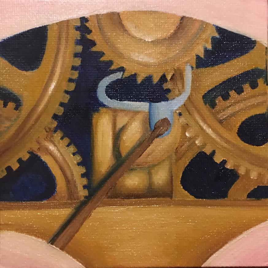
Clock- Dec 2017
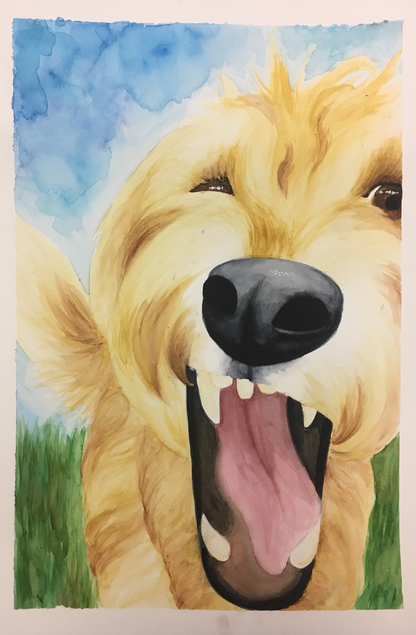
Hands -Dec 2017

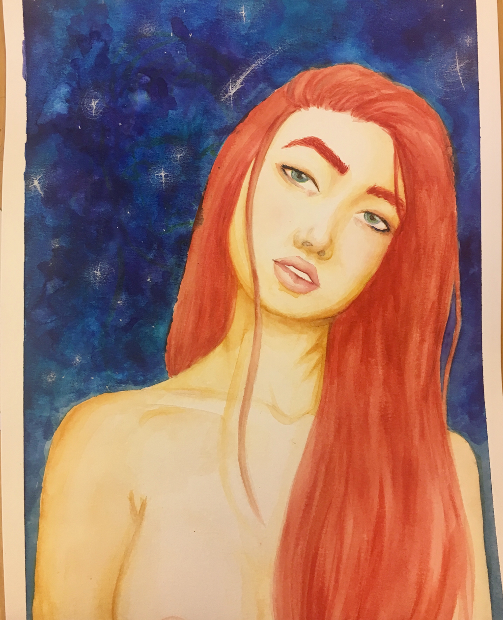
Foreshortening- Oct 2017
Abstract Fortune- Oct 2017
This piece is done in watercolor on watercolor paper. I didn’t use a reference picture for this piece and I really regret that. I feel
Fortune Cookies- Sept 2017
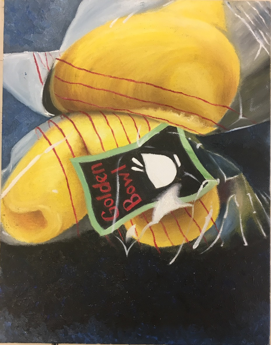
This Piece was a process. I ended up restarting 3 times because I didn't like each attempt. I'm still not fully satisfied with the result but I don't have the willpower to do another one. This piece was done in oil paint on a canvas board.
Fruit Series- Dec. 2016


Medium: Oil Paint
The assignment was to create a series of works where the subject is fruit or vegetables. For my pieces, I chose to do three different citrus fruits.
The assignment was to create a series of works where the subject is fruit or vegetables. For my pieces, I chose to do three different citrus fruits.
Untitled- Nov. 2016

Mediums: Pen
For this project, we were supposed to use contour lines to create an object. This assignment was difficult for me to create because I kept wanting to smooth out the lines. I really tried to get different line spacing but I ended up being too afraid of the piece to really create all the values I wanted to.
Since I was so focused on the technique, I never really looked at it from far away. After I finished, I realized how disproportionate the face is. The nose is too small and the hair is lopsided and the mouth is crooked. If I were to redo the piece, I would make sure to constantly be looking at a reference picture of what face proportions actually look like.
Candle- Nov.2016

Mediums: Oil Paint
The assignment for this piece was to create a pallet knife painting. Pallet knife paints create a lot of texture and while I love looking at texture, I suck at creating it in my art pieces. This piece was challenging for me. Everytime I picked up the pallet knife, I wanted to break it so I would be done with this project.
In the end, I like my finished piece. If I could redo it, I would think about the lighting more when I was creating it and not afterwords. The plate the candle is sitting on is too light for if the only source of light is one candle.
Untitled- Oct. 2016

Mediums: Grayscale brush pens, Metallic watercolor and India ink
For this assignment, we were supposed to create a figure drawing. I started the process of creating this piece by drawing a bunch of different sketches of humans in motion. After going back through all of the dancers and surfers, I came across this boxer. I realized that it could fit the idea of fighting for your dreams, yet losing.
To convey my message, I added bruises to the eye and chest to show how hard he's fighting. I put harsh shadows on the boxer to convey the harsh reality of not completing what he wanted to. The reds and oranges of the background were used to add to the emotion and heat of the moment. I used the black around the edges to convey the window of opportunity.
If I could redo this piece, I would start by practicing this in my sketch book more than one. I'm not really a fan of the way the watercolors turned out and I wish they could almost be more vibrant. I also would have liked the blending of the watercolor and India ink to be less harsh.
Self Portrait- Sept. 2016

Medium: Charcoal
This piece was created by using the technique of charcoal reduction. This process means you start with a layer of charcoal and erase it to form the face. This was done on gray construction paper so and white was added back in with white charcoal. This project was one of the most obnoxious pieces I have ever worked on. The charcoal never worked the way I wanted it to and everytime I fixed something a new problem would emerge. There is too much texture where it shouldn't have texture and I would love to go back and change that. If I were to redo it, I would work off of a picture of myself instead of using a mirror because I kept changing the angles ever so slightly, making it not look right.
This piece was created by using the technique of charcoal reduction. This process means you start with a layer of charcoal and erase it to form the face. This was done on gray construction paper so and white was added back in with white charcoal. This project was one of the most obnoxious pieces I have ever worked on. The charcoal never worked the way I wanted it to and everytime I fixed something a new problem would emerge. There is too much texture where it shouldn't have texture and I would love to go back and change that. If I were to redo it, I would work off of a picture of myself instead of using a mirror because I kept changing the angles ever so slightly, making it not look right.
Untitled- Aug. 2016

Mediums: Prisamcolor pencils and Charcoal
The assignment was to create movement in the piece through mark making. This was a challenge for me and I'm not sure I overcame it. This piece is very smooth and doesn't contain much mark making, especially in the color pencil section. I liked how I was able to get a variety of colors into the piece. If I could do something differently, I would plan how all the colors fit together. I also would have tried to blend the charcoal and the colored pencils together so the line between them wouldn't be so harsh.
The assignment was to create movement in the piece through mark making. This was a challenge for me and I'm not sure I overcame it. This piece is very smooth and doesn't contain much mark making, especially in the color pencil section. I liked how I was able to get a variety of colors into the piece. If I could do something differently, I would plan how all the colors fit together. I also would have tried to blend the charcoal and the colored pencils together so the line between them wouldn't be so harsh.
