Hands- 2018
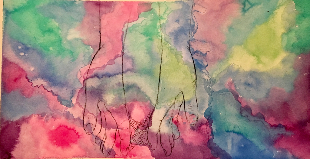
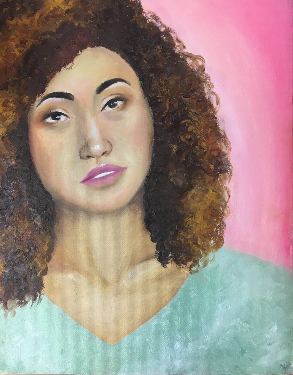
For this piece, I experimented with adding more colors to the backgrounds. Instead of sticking to one or two colors, I have multiple
Connections- Feb 2018
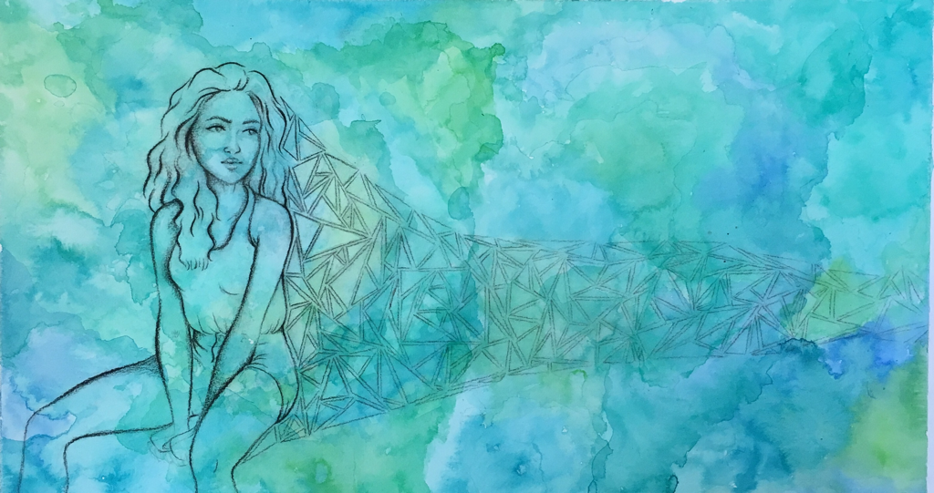
For this piece, I experimented with the contrast of organic and geometric which lead to some interesting effects because of the medium choice. I picked charcoal for the subject and triangles to contrast the smoother background with a rugged finish. I really struggled with keeping the charcoal in one spot when working and creating fine lines with the charcoal. Over all I think I completed my desired effect after the struggle.
My inspiration for this piece was derived from an artist on Instagram (@samualharrisonart) who created beautiful portraits with an abstract touch of color. I tried to use the element of color in a similar manner to convey emotion in the same way.
My piece really started from the color and evolved from there. Once I had the background, I added the subject which didn’t feel complete. To create my common thread of connection, I added the triangles to “connect” it to the next piece.
If I could do something over I would have used pen instead of charcoal. The charcoal was difficult to work with and I think since I am better with pen, it would have looked better.
My piece connects to my other pieces through the idea of connection.
Free Falling- Jan 2018
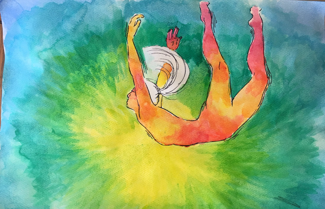
For this piece, I tried using colored India inks. I really enjoyed working with them but I struggled a bit when trying to blend the colors because they dry so quickly. I discovered some interesting textures when exploring this medium and over all I am happy with the result.
The artist I used for inspiration I found on Pinterest under the name claralieu2. She created this beautiful drawing of the human form and created so much movement within the piece and I wanted to create a similar effect. In the end, my piece feels very different and I wish I captured a movement similar to hers.
Originally I had planned to only stick to warm colors and almost have the colors flow out of the subject but while painting I had a change of heart. I'm happy with this change and I really like the color contrast it created. Other than that small change, I pretty much kept the piece the same throughout the process.
If I could do something over, I would probably try messing around more with the techniques I used to put down the color. While I am happy with the result, I wish there were more differences in texture between the figure and the background. I also wish I had been more careful when painting around the figure because there are some parts where the background color overlaps with the figure.
This is going to sound really bad but I think I'm changing my common thread and this piece doesn't really fit... (I'm sorry)
3am- Dec 2017
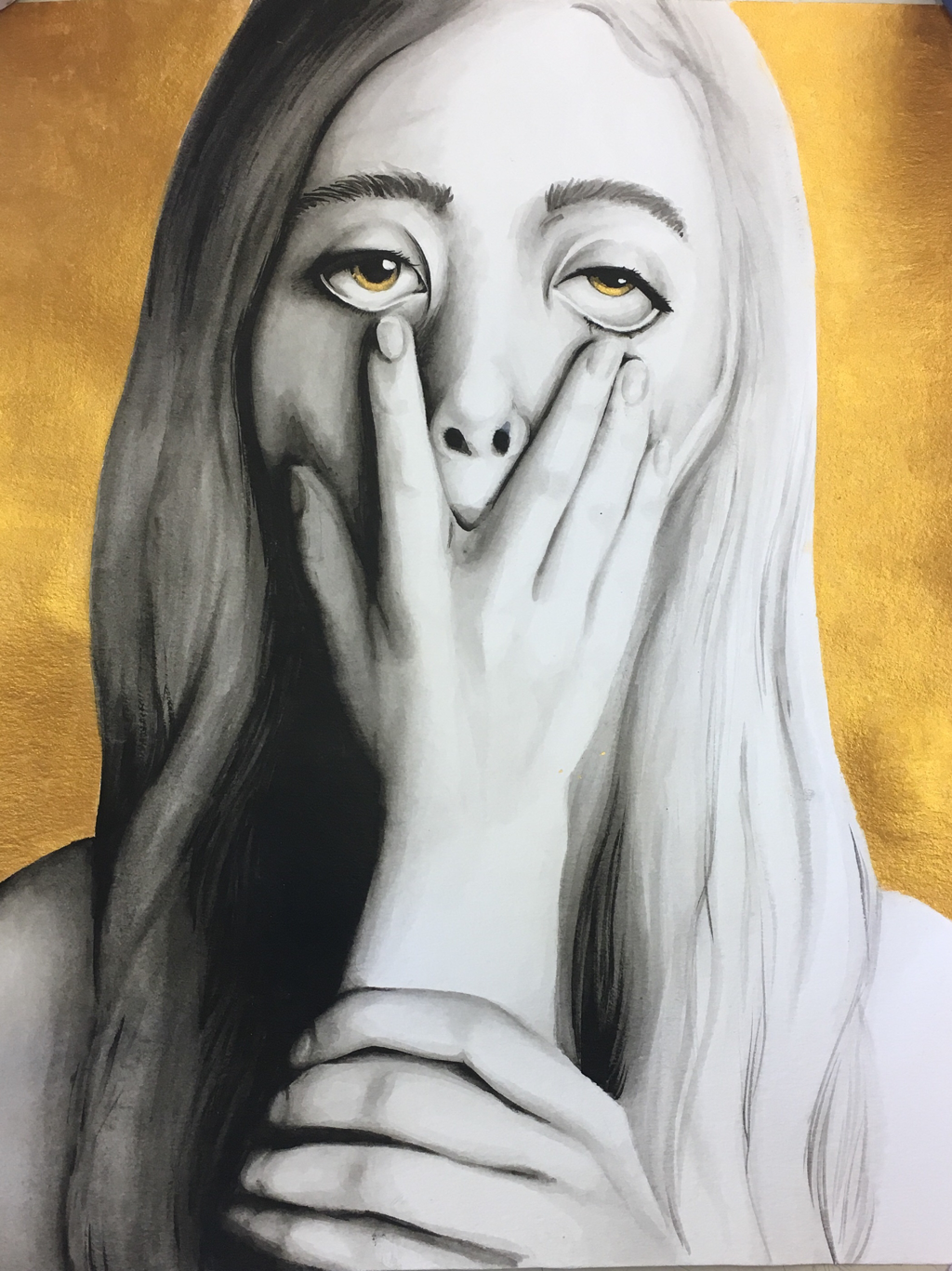
For this piece I tried using ink but instead or using it like normal, I used a ink brush pen and used water to dilute it. I think it was generally successful but it was hard to get the very light shades using this technique. I was inspired by Sia’s music videos and how much emotion was captured through the dancing. I wanted to capture the same emotion so I made this piece. I feel like it’s a little stiff but I’m not sure how to fix it. This piece was originally going to be just black and white but with just the black and white, it seemed kinda basic. So to make it a little more interesting I added the gold. Overall it stayed on track. If I could do it over I would fix the proportions. The nose is a little small and the hand is slightly off. Other than that I like the piece.
Currently I’m thinking of changing my theme but it will probably include humans so it fits that way
Currently I’m thinking of changing my theme but it will probably include humans so it fits that way
Untitled- Nov 2017
For this piece, I tried to add texture in the hair to make the piece more interesting. To create the texture I had to try different techniques then I was used to. Since I was uncomfortable with creating the texture, it turned out uneven and weird. I’m not really happy with it and I’m not happy with the color choices I made.
Untitled- Nov 2017
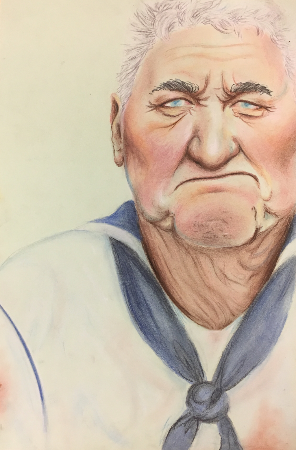
For this project, I wanted to challenge myself. Normally when creating a portrait, I stick to smoother skin because I am comfortable with it. But I wanted to try something a little different which is how I ended up with my subject.
To me, there is something powerful about eyes, especially when they are framed by multitudes of wrinkles. So when creating this piece, I tried to make sure all the compositional elements lead the viewer to focusing on the eyes. Generally speaking. I feel like I accomplished this goal. The lightness of the eyes contrasts well with the dark shadows in the surrounding space. However with the similar toned color in the background, it takes a little away from the glassy eye.
Throughout the creation of the piece, I struggled a lot with the medium, chalk pastel. While I was able to fix any mistake I made because of how lift-able it is, I would continuously smudge what wasn't supposed to be smudged. This slowed down my work process incredibly because I would keep having to go back and fix my mistakes. One of the amazing things about chalk pastel was that I was able to create a huge variation of tones and colors into the subjects skin. I am proud of how I accomplished this and how it adds depth to the piece.
If I could re-do this piece, I would probably have more of a plan in mind before I started. I started with the subject on the final and didn't do any thumbnail sketches before hand. I feel that if I had done that to begin with I would have decided on a stronger composition which would have benefited the final piece. It also might have helped me create more of a focus on the eyes if I had been planning it out before hand.
Overall, I am happy with how I took a new medium to me and a challenging subject and created this piece.
Lucky- Sept 2017

Lucky was inspired by an Instagram artist who I absolutely adore (@lesya_poplavskaya). She is able to put a variety of colors into the skin of her portraits and my goal for this piece was to do the same. While I added different colors then I normally would around the eyes, I struggled using color to add depth to the face. When painting, I was scared to lay down color that wasn't obviously a skin tone because I was afraid to mess up.
When first creating this piece, I believed I was going to make a piece about being inside your own head. It turns out, how I want to convey this wasn't showing the message I wanted at all so I scraped that idea and painted a night sky in the background instead. I need this because I thought the darkness of the night sky would contrast well with the persons pale skin. With this change, I chose a meaning of luck and what it could mean. The girls facial expression is melancholy which was meant to suggest that everything might not be going right for her. She is nude to convey vulnerability which adds to that effect. The shooting star was meant to represent luck and since it was behind her head, it was meant to symbolize how the girl turned her back on luck.
When first creating this piece, I believed I was going to make a piece about being inside your own head. It turns out, how I want to convey this wasn't showing the message I wanted at all so I scraped that idea and painted a night sky in the background instead. I need this because I thought the darkness of the night sky would contrast well with the persons pale skin. With this change, I chose a meaning of luck and what it could mean. The girls facial expression is melancholy which was meant to suggest that everything might not be going right for her. She is nude to convey vulnerability which adds to that effect. The shooting star was meant to represent luck and since it was behind her head, it was meant to symbolize how the girl turned her back on luck.
