Ink Series- Apr 2017


Acrylic ink
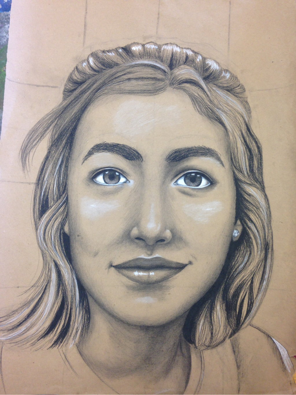
For this project, I experimented with a new media. I had never used acrylic ink before and so I decided to make a series of faces to learn how to use the media. To use ink, you have to be patient. Being patient is not my strong suit. I made so many mistakes because I didn't wait for the ink to fully dry. Since ink is very permanent, you can still see the mistakes on the final product. Originally, I was only going to do one face but I finished the first face really fast so I decided to make it a series. Since it became a series, I had to modify what my original idea was. First, I just wanted to paint a face. But when I made it a series, I decided to make it about diversity. If I could do something over, I would be more patient when painted because I don't like how they all turned out. These pieces link to my other pieces because my common thread is human faces.
For this project, I experimented with a new media. I had never used acrylic ink before and so I decided to make a series of faces to learn how to use the media. To use ink, you have to be patient. Being patient is not my strong suit. I made so many mistakes because I didn't wait for the ink to fully dry. Since ink is very permanent, you can still see the mistakes on the final product. Originally, I was only going to do one face but I finished the first face really fast so I decided to make it a series. Since it became a series, I had to modify what my original idea was. First, I just wanted to paint a face. But when I made it a series, I decided to make it about diversity. If I could do something over, I would be more patient when painted because I don't like how they all turned out. These pieces link to my other pieces because my common thread is human faces.
Photo Series- Mar 2017


Photography
For this project, I really wanted to capture the interaction between life and emotions. For these pieces, I wanted to show both good sides, like creativity and fun, and the less good parts, like loneliness and over-thinking.
This project was challenging for me because I had so many other ideas for a photography series but with the requirements, I was not able to create exactly what I wanted. In the end, I am satisfied with the pieces.
Through out creating this piece, I learned a lot about getting the proper lighting and setting to make the photo pop. I took a lot of photos were Kendal blended into the background and the pieces didn't turn out
If I could redo this series, I would not have the setting of the photo shoot on school grounds. Sadly since I completed it during class time, I didn't really have any other options. While the plainness of the background does put more emphasis on Kendal, it does look a little boring and doesn't draw your eye to it.
Hero Piece- Feb 2017

Oil on canvas
This project went through many changes though out the duration of its completion. I was always planning to do a flower because it really represents my hero. My hero is one of my old friends from middle school who showed me what being strong means. What I wasn't planning on was the background. At first I was going to transcribe the letter she wrote me when I moved but then I decided to paint a gloomy background to represent her life and where she has lived. In the end, I made stones the background because stones represent all of the memories we have together.
This piece was inspired by the work of Georgia O'Keefe because of her flower paints and the smoothness of the petals.
If I could do this over, I would create shadows under the flower and create a unifying light source to make sure the flower and stones connect.
Self Portrait- Jan 2017
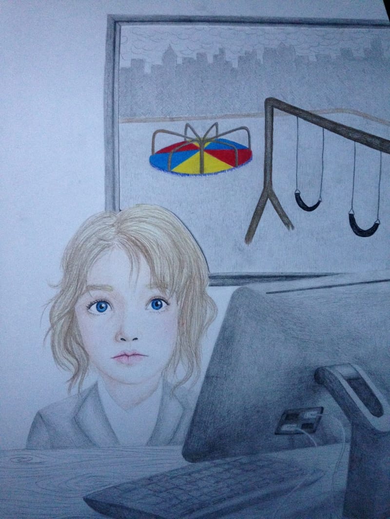
Childhood to Adulthood - Dec 2016
Still Life- Nov. 2016

Pencil and Prismacolor Pencils
For this piece, I really wanted to draw a skull for the main subject for the still life. I find skulls very intersting because of all the different proportions. The only problem is they are very difficult to draw. I spent ages sketching skulls from different angles, trying to get it perfect. I am happy with the end result of the skull but I wish I had spent less time on the planning.
While still in the planning stages, I saw these sunflowers on Ms. O'Ryan's desk. I loved all the texture it had and I knew it needed to be in my piece. Honestly I dont think I did the flowers justice. They don't have as much depth and texture as the flowers in real life. They also blend into the background and I wished they popped out.
Social Issue Piece- Oct. 2016

India Ink, Grayscale Brush Pens, and Metallic Watercolors
This piece was inspired by figure drawings of people in motion. I wanted to convey the idea of the fight and fighting for survival. In this piece, I wanted the focal point to be the arm in motion, the punch. I don't think I really achieved that in my piece. To emphasize this, I should have added more red around the arm and have more of a pattern in the background to draw the attention to the punch. I also would have moved him to a different location on the page to allow the motion to flow across the page. I also wish the black around the paper faded into the watercolor more.
The figure is bruised to express the difficultly in fighting for survival. This piece is meant to represent the hardships of oppression and how you can never really stop fighting. The black around the edges is supposed to represent the window of opportunity and how its closing. The desperation in the figures face is meant to show how he knows that the window is closer and he knows he might not make it.
Overall, there is a lot I would change but I am fairly satisfied about how it turned out.
Self Portrait- Sept. 2016
|
India Ink and Watercolor
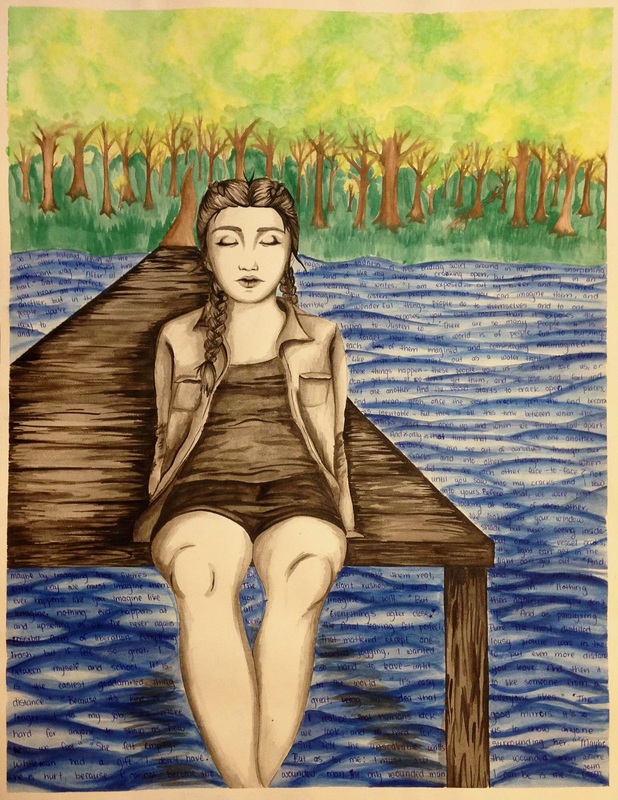
For my self portrait, I drew myself in black and white because sometimes I feel out of place, like I don't fit in all the way. I'm sitting in this nature scene because of the emotional isolation I sometimes feel. I made the leaves on the trees a mix of yellow in green to create this idea of a transition. The trees are transitioning from summer to fall and I'm transitioning from a child into an adult. During the making of this piece I struggled with the proportions of my body. I did a lot of sketches but the final product seems a little flat. If I could change it, I would definitely add more of a variety of values into the dock and me in order to create more contrast. I also struggled with the watercolor. Watercolor never behaves how I think it will and I would have liked to change how I created the trees if I could redo it. If I could change it, I would make the piece a little more balanced by either adding darker colors to the trees or lightening the water. Overall, I think the piece is very bottom heavy. For this piece, we were supposed to find an artist for inspiration, I found a watercolor artist who creates amazing portraits and landscapes. Her website is |
Confidence Boost Drawing- Aug. 2016
|
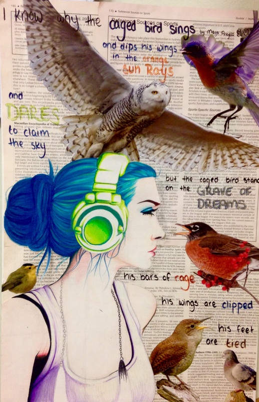
Prismacolor pencils and collage
For this piece, we all started with the same picture to base the girl off of. We did the drawing in class together but as soon as we finished the sketch we were on our own. The options for materials to add the element of color to the girl was oil pastels and colored pencils. I stayed within my comfort zone and used colored pencils. In the girl, I regret making the skin so light. I was scared of adding too much color because I was worried the skin would no longer be smooth but now she just looks washed out. For the collage in the background, I used a repeating element of birds to touch on the idea of freedom. To me, the girl seemed unhappy in the photo we were working from so in my piece I gave her a reason why. Birds represent freedom because wild birds can fly and be wherever they want to be. I imagined the girl as a caged bird. Birds are meant to have freedom and caging them is against their nature. Before with just the birds and the girl, the piece seemed incomplete. After talking to Ms. O'Ryan, I added certain phrases from the poem I Know Why the Caged Bird Sings by Maya Angelo. The phrases I choose stood out to me because they contained the most emotion that related to the ideas I wanted to convey. I used the element of color to create emphasis on words that I believe held the most emotion. Overall, I feel the piece still seems incomplete and out of place. If I could redo it, I would add more color to the girl and make sure the girl and the background fit together better. |
